Food Delivery App Performance Dashboard
Problem Statement:
- Objective: To perform an end-to-end analysis of Zomato’s performance across:
- City-wise Performance
- User Performance
Approach:
Tool Used: Exploratory Data Analysis (EDA) was done using Power BI
Step-wise Approach:
- Data Import:
All relevant data sources, mainly Excel files, were imported into Power BI for analysis.
2. Data Cleaning:
Data cleaning was performed within Power BI to handle:
Null values: Missing or incomplete data points.
Inappropriate Data Types: Ensuring that fields like dates, numerical values, and categorical variables were in the correct format.
3. Data Modeling:
Established relationships between the various tables in the Data Model within Power BI to ensure consistency and accurate data representation.

4. Measure Creation:
Created various measures in Power BI to capture important fields that could be used for creating meaningful visualizations and insights in the report.

5. Visualization & Reporting:
Developed a colorful and interactive visualization dashboard in Power BI that displayed key performance indicators (KPIs) and allowed users to filter and analyze the data effectively.


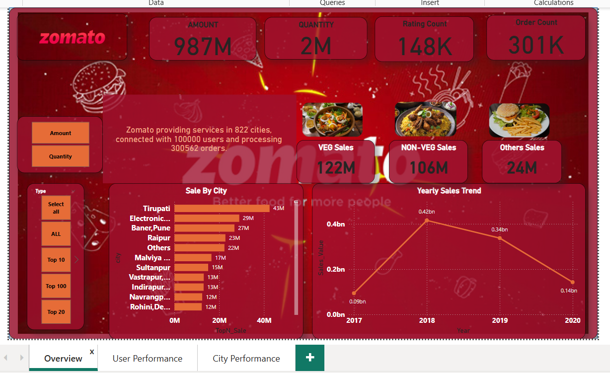
Key Performance Indicators (KPIs):
- Amount and Quantity:
These are the core KPIs to analyze sales performance. Based on these two, other KPIs can be filtered and visualized. - Sales Data:
- Sale_Value: Total value of sales made.
- Rating Count: Number of ratings received for each order.
- Order Count: Number of orders made.
- Veg Sales, Non-Veg Sales: Sales categorized by food type.
- Other Sales: Sales from other categories beyond Veg/Non-Veg.
- Top 5/10/20/50/100 Sales By City: Identifies the best-performing cities based on sales.
- Yearly Sales Trend: Analysis of how sales performed over different years.
- Sale_Value: Total value of sales made.
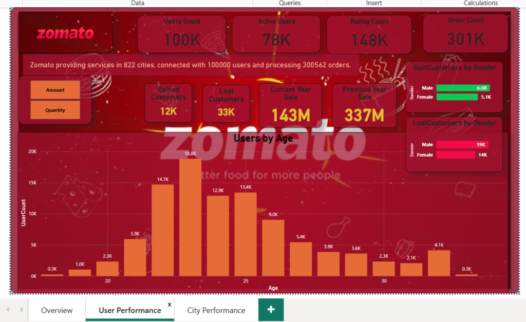
User Performance KPIs:
- Gained Customers:
- Breakdown of new customers gained, categorized by gender.
- Male customers have the highest proportion of gained users.
- Lost Customers:
- Breakdown of lost customers, categorized by gender.
- Male customers have the highest proportion of lost users.
- Users by Age:
- Most users are in the age group of 22-25, providing insights into the target demographic.
- Current Year Sales vs. Previous Year Sales:
- Comparison of sales figures between the current year and the previous year.
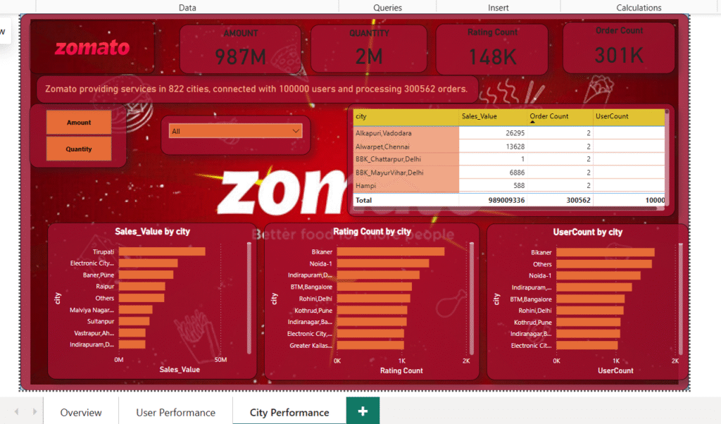
City-wise Performance KPIs:
- Sale by City:
- The city of Tirupati is the top-performing city in terms of sales.
- Rating by City:
- Bikaner has the highest ratings across cities, indicating customer satisfaction.
- User Count by City:
- Bikaner also has the highest number of users, showing a large active customer base.
Key Insights and Outcome:
- The dashboard provides a detailed, interactive view of Zomato’s performance across different cities and user categories.
- It helps identify areas of growth (e.g., top-performing cities like Tirupati) and areas needing attention (e.g., high customer churn in male users).
- It also allows Zomato’s management to drill down into specific KPIs and make data-driven decisions to improve user engagement and sales performance.
This project demonstrates the ability to clean, model, and visualize data effectively using Power BI while providing valuable insights for improving business performance.